Your business card is often the first impression you make. A standard business card can open doors, start conversations, and leave a lasting mark.
Thank you for reading this post, don't forget to subscribe!But how do you make sure yours stands out without overcomplicating things? This article will guide you through everything you need to know about standard business cards—what makes them effective, how to design one that truly represents you, and why they still matter in a digital age.
Keep reading, and you’ll discover simple tips to make your business card work harder for your success.

Credit: www.digital-print-solutions.com
Choosing The Right Size
Choosing the right size for standard business cards matters a lot. The size affects how your card looks and feels. It also impacts how easy it is to carry and store. A perfect size helps your card stand out without being too big or too small.
Many business cards follow a common size, but some variations exist. The choice depends on your style and purpose. The card must fit comfortably in wallets and cardholders. It should also allow enough space for your information.
Understanding Standard Business Card Sizes
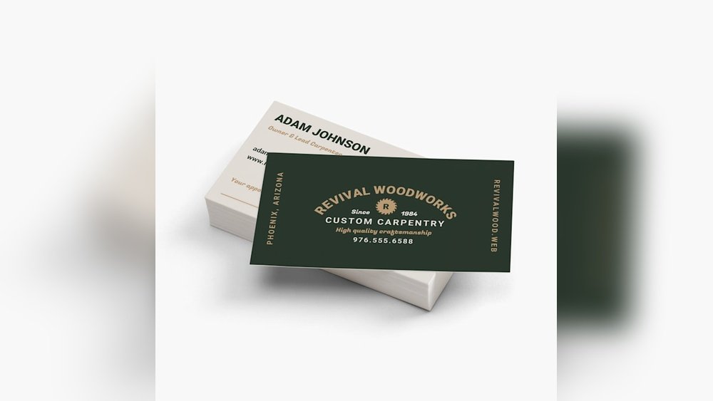
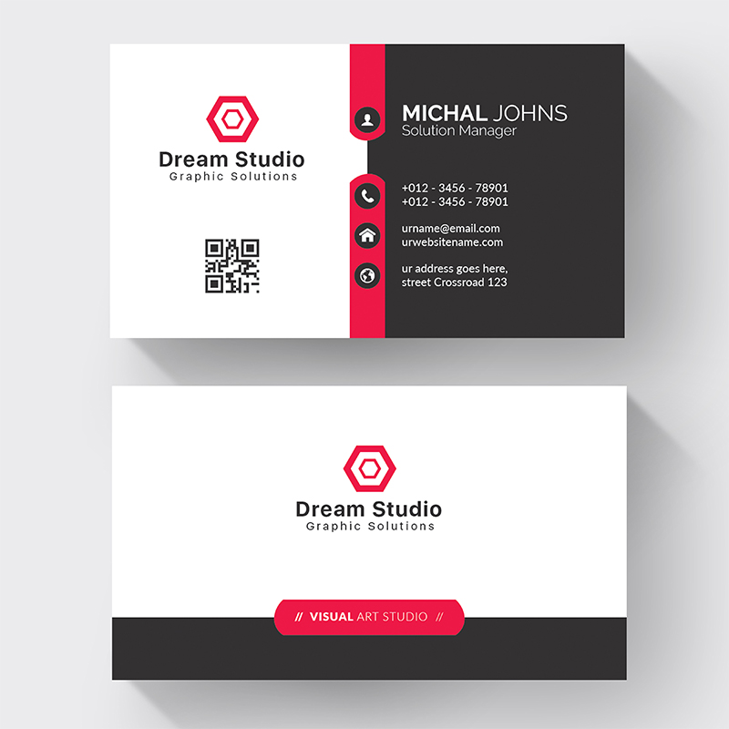
The most common size is 3.5 inches by 2 inches. This size fits most wallets and cardholders. It gives enough room for your name, contact, and logo. People recognize this size easily. It looks professional and is easy to handle.
Choosing A Size That Matches Your Brand
Think about what your brand says. A classic brand suits the standard size well. A creative or modern brand might try a square or mini size. Small cards can look unique but may have less space. Bigger cards give more room but can be bulky.
Considering Practical Use And Storage
Standard sizes fit in most wallets and business card holders. Too large cards may be thrown away or lost. Too small cards might be hard to read. Aim for a size that balances style and function. Easy to carry means easy to share.
Credit: hikeprint.com
Selecting Quality Materials
Choosing the right materials for standard business cards is key. Good materials create a strong first impression. They help your card feel professional and durable. Poor materials can make your card look cheap and forgettable.
The material affects how your card looks and feels. It also changes how easy it is to write on the card. Selecting quality materials ensures your card lasts longer.
Paper Type
Paper is the base of every business card. Thick paper feels more solid and valuable. Common weights for cards range from 300 to 400 gsm. Matte paper gives a smooth, non-shiny finish. Glossy paper shines and makes colors pop. Choose paper that suits your brand style.
Card Thickness
Thicker cards feel stronger and more durable. Thin cards may bend or crease easily. Standard thickness ranges between 14pt to 16pt. Thicker cards cost more but leave a better impression. Pick a thickness that balances cost and quality.
Coating Options
Coatings protect your card from damage and stains. UV coating makes cards glossy and shiny. Matte coating offers a soft, elegant look. Soft-touch coating feels smooth and velvety. Coatings also affect how easy it is to write on the card.
Effective Design Elements
Effective design elements make standard business cards stand out. These elements help share your brand clearly. The right design attracts attention and leaves a good impression.
Choosing the best colors, fonts, and logo placement is key. Each part plays a role in making the card easy to read and remember. A well-designed card looks professional and trustworthy.
Color Schemes
Colors create mood and catch the eye. Use colors that match your brand style. Avoid too many bright colors that can confuse the message. Soft or bold colors work well depending on your business type. Contrast between background and text helps readability. Keep the palette simple with two to three colors.
Typography Choices
Fonts should be clear and easy to read. Choose simple fonts like Arial or Helvetica. Avoid fancy fonts that look hard to understand. Use one or two font styles to keep the design clean. Make sure font size is big enough for small cards. Bold important information like your name or job title.
Logo Placement
The logo shows your brand identity. Place it where it is easy to see but not too large. Top left or center works well for most designs. Leave space around the logo to avoid clutter. A well-placed logo creates balance and draws attention. It helps people remember your business faster.
Crafting Clear Contact Info
Clear contact information is the heart of every standard business card. It helps people reach you quickly and easily. Confusing or cluttered details can make your card useless. Simple, precise info makes a strong impression and builds trust.
Focus on clarity over quantity. Include only the most important details. This keeps your card neat and easy to read. The goal is for contacts to find what they need at a glance.
Choose The Right Contact Details
Pick the contact info that suits your business best. Typically, include your phone number and email address. Add your website if it’s simple and professional. Avoid too many social media links—they can clutter your card.
Use Readable Fonts And Sizes
Select fonts that are clear and easy to read. Avoid fancy or overly thin fonts. Keep font size between 8 and 12 points. This ensures details stand out without crowding the card.
Organize Information Logically
Arrange your contact details in a simple order. Start with your name and job title. Follow with phone number and email. Place the website or address last. This flow helps the reader find info fast.
Leave Enough Space Around Text
Give each detail some breathing room. Avoid cramming text too close together. White space improves readability and overall look. A clean card feels professional and welcoming.
Incorporating Branding Consistency
Incorporating branding consistency in standard business cards builds trust and recognition. A consistent look makes your brand easy to remember. It shows professionalism and attention to detail.
Every element on the card should match your brand style. Colors, fonts, and logos must stay the same as other materials. This creates a strong, unified brand image.
Using Brand Colors Effectively
Choose your brand colors carefully for the card’s design. Use primary colors to highlight important information. Avoid too many colors to keep the design clean. Consistent colors make your card stand out and link to your business.
Choosing Fonts That Match Your Brand
Select fonts that reflect your brand personality. Use the same font as your website or brochures. Keep font sizes readable and simple. Consistent fonts help people recognize your brand quickly.
Placing Your Logo Correctly
Place your logo where it gets the most attention. Usually, the top left or center works best. Make sure the logo size fits well with other elements. A clear logo reinforces your brand identity on the card.
Maintaining Consistent Messaging
Keep your message clear and consistent across all cards. Use the same tagline or slogan from your marketing. Avoid changing contact details or job titles often. Consistent messaging makes your brand reliable and trustworthy.
Adding Unique Finishes
Standard business cards can stand out with unique finishes. These finishes make cards look more professional and memorable. Simple cards become special with the right touch. Unique finishes add texture, shine, and style. They help your card feel different from others.
Embossing And Debossing
Embossing raises parts of the card’s surface. It creates a 3D effect you can feel. Debossing presses the design into the card. This leaves an indented pattern. Both finishes add a classy, tactile element. They highlight logos, names, or important details. The touch makes your card more engaging.
Foil Stamping
Foil stamping uses shiny metallic foil on the card. Gold, silver, or bright colors catch the eye. The foil creates a smooth, reflective finish. It makes text or designs pop with elegance. This finish works well for logos and borders. It adds a luxurious look without extra bulk.
Spot Uv Coating
Spot UV coating applies a glossy layer on certain parts. It contrasts with the matte or uncoated background. This finish highlights logos, images, or important text. It adds shine without covering the whole card. Spot UV creates a modern and stylish effect. It draws attention to key details quickly.
Optimizing For Distribution
Optimizing your standard business cards for distribution means making them easy to share and remember. A well-designed card can leave a strong impression and help you build connections. Focus on clarity, size, and how people will carry or store your card.
Keep your card simple and clean. Avoid clutter to make key information stand out. Choose materials and sizes that fit wallets or cardholders easily. Think about how and where you will give out your cards.
Design For Easy Handling
Use a size that fits standard wallets or card cases. This encourages people to keep your card longer. Rounded corners can prevent damage and make cards feel nicer. A smooth finish helps cards slide out easily.
Include Clear Contact Information
Display your name, phone number, and email clearly. Use a readable font size and style. Avoid crowding text; leave space around important details. People should find your contact info quickly.
Choose Durable Materials
Pick sturdy cardstock to avoid bending or tearing. A matte or glossy finish can protect against dirt and water. Durable cards last longer in wallets and pockets. This increases your chances of being remembered.
Plan For Targeted Distribution
Bring cards to events where your audience gathers. Hand them out personally to create connections. Leave cards in places your potential clients visit. Make it easy for the right people to get your card.

Credit: www.cedarhousemedia.com
Frequently Asked Questions
What Size Are Standard Business Cards?
Standard business cards usually measure 3. 5 x 2 inches. This size fits well in wallets and cardholders. It’s a common and easy-to-carry size.
What Information Should A Standard Business Card Include?
A business card should include your name, job title, and company name. Also add contact details like phone number and email. Keep it clear and simple.
What Paper Thickness Is Best For Business Cards?
Most business cards use 300 to 350 gsm paper. This thickness feels sturdy and professional. Thicker cards last longer and feel good to touch.
Can I Print Standard Business Cards At Home?
Yes, you can print them at home using a good printer. Use quality card stock for best results. But professional printing gives sharper and cleaner cards.
How Many Colors Should I Use On A Business Card?
Use two to three colors for a clean look. Too many colors can make the card look messy. Stick to your brand colors for recognition.
Should I Use Both Sides Of A Business Card?
Using both sides is smart to share extra info or design. The front usually has the main details. The back can hold a logo or a simple message.
How Long Do Standard Business Cards Last?
Business cards can last years if kept safe and dry. Avoid bending or wetting them to keep them neat. Good quality cards stay fresh longer.
Conclusion
Standard business cards help you share contact details clearly and quickly. They make a good first impression. A clean design keeps information easy to read. Choose quality paper for a strong feel. Keep your cards simple to avoid confusion. Handing out cards builds connections and trust.
Everyone benefits from having a reliable business card. Small, simple, and useful. A smart choice for any professional setting.