
Are you looking to give your space or project a fresh, stylish look? Browsing design ideas can be overwhelming, but it doesn’t have to be.
Thank you for reading this post, don't forget to subscribe!Imagine finding the perfect style that fits your taste and needs effortlessly. You’ll discover simple ways to browse design options that inspire you and make decision-making easier. By the end, you’ll feel confident and excited to bring your vision to life.
Ready to explore design like never before? Let’s dive in!
Credit: stock.adobe.com
Choosing The Right Design Style
Choosing the right design style shapes how your project looks and feels. It influences user experience and communicates your message clearly. Picking a style that fits your goals creates a stronger impact. This choice guides colors, fonts, and layouts. It also helps keep your design consistent and appealing.
Popular Design Styles
Minimalist design uses simple shapes and clean lines. It focuses on space and basic colors. Modern design includes bold colors and new ideas. It often uses geometric shapes and sharp edges. Vintage style brings old-school charm with classic fonts and muted colors. It creates a warm and nostalgic feeling. Flat design avoids shadows and textures. It uses bright colors and simple icons. Each style has a unique look and feel.
Matching Style To Project Goals
Think about what your project needs to say. A professional service may choose clean and simple styles. Creative projects might use bright colors and fun shapes. Websites for children often use playful and bold designs. Matching style to purpose helps users understand your message fast. It makes your project more effective and enjoyable.
Color Theory In Design
Color theory is a key part of design. It helps designers choose colors that work well together. Colors affect how people see and feel about a design. Using the right colors can make a design stand out and feel balanced.
Understanding color theory helps create designs that attract attention. It also guides the mood and message of the design. Designers use color theory to make clear and strong visuals.
Effective Color Combinations
Effective color combinations use colors that match or contrast well. Complementary colors, like blue and orange, create strong contrast. Analogous colors, such as green, blue, and teal, offer harmony and calmness. Triadic colors use three colors evenly spaced on the color wheel. These combos keep designs balanced and interesting.
Too many colors can confuse the viewer. Stick to two or three main colors. Use shades and tints to add variety without clutter. Good color choices guide the eye and highlight key parts of the design.
Using Color To Evoke Emotions
Colors trigger emotions and feelings in people. Red can create excitement or urgency. Blue often feels calm and trustworthy. Yellow brings happiness and energy. Green suggests nature and peace. Designers pick colors based on the emotion they want to share.
Color can also affect how easy a design is to read or use. Bright colors catch attention but may tire the eyes. Soft colors create a relaxed mood but might be ignored. Thoughtful color use connects the viewer to the design’s purpose and message.
Typography Tips
Typography shapes how people see and feel your design. It guides readers and sets the tone. Good typography makes content clear and inviting. Poor typography can confuse or tire the reader. Simple rules help create strong typography that works well.
Focus on font choices, spacing, and size. These details improve user experience. The following tips focus on font pairing and readability. They help create designs that look good and feel easy to read.
Font Pairing Techniques
Choose fonts that contrast but also match in style. Pair a serif font with a sans-serif for balance. Use one font for headings and another for body text. Limit fonts to two or three to avoid clutter. Check how fonts look on different devices. Test combinations to find harmony and clear hierarchy.
Readability And Accessibility
Use font sizes that are easy to read on all screens. Keep line spacing wide enough to separate lines clearly. Avoid using all caps for long text blocks. Use colors with strong contrast between text and background. Ensure fonts support multiple languages and special characters. Test your design with screen readers for accessibility.
Incorporating Visual Hierarchy
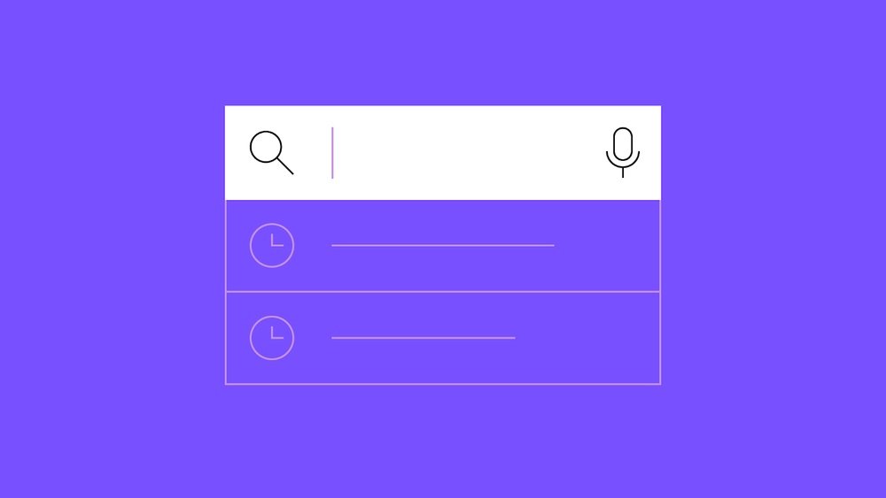
Incorporating visual hierarchy is key in Browse Design. It guides users through content easily. It helps highlight the most important parts first. This makes the design clear and simple to use. Visual hierarchy organizes information visually. Users can scan and understand pages quickly. It improves user experience and keeps visitors engaged.
Prioritizing Elements
Start by deciding which elements matter most. Important items get top priority. Place these elements where eyes go first. Use layout and spacing to separate them. Less important items appear smaller or lower on the page. This helps users focus on main content. Prioritizing elements creates a natural flow in design.
Using Size And Contrast
Size tells users what to notice first. Larger items grab attention quickly. Smaller items support the main content quietly. Contrast helps separate elements clearly. Use different colors or brightness for contrast. High contrast makes text and buttons stand out. Low contrast keeps background and less important parts subtle. Size and contrast together make content easy to read and follow.
Utilizing Negative Space
Negative space is the empty area around and between design elements. It helps create balance and makes designs easier to understand. Using negative space well allows each part of the design to breathe. It stops the design from feeling crowded or busy. Negative space guides the viewer’s eye to important parts. It also adds a clean and modern look to the design.
Balancing Design Elements
Negative space balances text, images, and other parts of a design. It keeps designs from feeling too heavy or cluttered. Space around elements makes each piece stand out more. This balance helps viewers see the design clearly and enjoy it. It also gives a sense of order and calmness. Good balance improves the overall look and feel of the design.
Enhancing Focus And Clarity
Negative space directs attention to the main message or image. It removes distractions by separating important parts from others. Clear space around text improves readability and understanding. It helps viewers focus on what matters most. Space also makes designs look neat and simple. This clarity helps deliver the message fast and effectively.
Credit: www.youtube.com
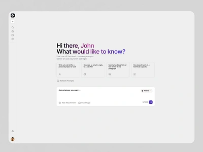
Leveraging Design Tools
Design tools help turn ideas into real visuals. They make the creative process faster and clearer. Using the right tools, designers can create better work in less time.
Good design tools offer many features. They help with drawing, editing, and organizing projects. Choosing the right software can improve your workflow and final results.
Popular Software Options
Adobe Photoshop is widely used for image editing and graphic design. It suits photo manipulation and digital art very well. Adobe Illustrator works best for vector graphics and logos. Its precision is ideal for scalable designs.
Sketch focuses on user interface and web design. It offers simple tools for creating wireframes and prototypes. Figma is popular for collaboration. Teams can work together in real time online.
Canva is easy to use for beginners. It offers templates and drag-and-drop features. These options fit well for quick social media posts and presentations.
Tips For Efficient Workflow
Organize your files clearly. Use folders and consistent naming to find work fast. Learn keyboard shortcuts to speed up common tasks. This saves time and reduces clicks.
Use templates for repeated projects. Templates keep your style consistent and cut design time. Break large projects into smaller parts. Focus on one section at a time for better results.
Regularly update your software. New versions often fix bugs and add useful features. Back up your work often to avoid losing progress.
Trends And Innovation
Design trends and innovation shape the way we create and experience websites. They keep designs fresh, useful, and attractive. Staying updated helps designers meet user needs and stand out.
Current Design Trends
Minimalism remains popular for clear, clean layouts. Bold colors catch attention and create mood. Dark mode helps reduce eye strain and looks modern. Large typography guides users and highlights key messages. Animated elements add life without distracting visitors.
Incorporating New Techniques
Using AI tools speeds up design tasks and suggests ideas. Responsive design ensures sites work well on all devices. Voice user interfaces improve accessibility and ease of use. Micro-interactions create small, helpful feedback moments. Experimenting with 3D graphics enhances depth and engagement.
Credit: dribbble.com
Frequently Asked Questions
What Is Browse Design In Web Development?
Browse design is how a website’s pages and menus are arranged. It helps users find information quickly and easily. Good browse design improves the overall user experience.
Why Is Browse Design Important For Websites?
Browse design guides visitors through a site smoothly. It reduces confusion and keeps users engaged longer. Clear navigation also helps search engines understand your site better.
How Can Browse Design Improve User Engagement?
A simple browse design lets users find what they want fast. It encourages visitors to explore more pages. This increases the chances they will return to your site.
What Are Key Elements Of Effective Browse Design?
Effective browse design uses clear menus, logical categories, and search options. It also includes clickable links and easy-to-read labels. These elements make browsing simple and intuitive.
How Does Browse Design Impact Seo?
Good browse design helps search engines index pages correctly. It creates a clear site structure with easy navigation paths. This can improve your site’s ranking in search results.
Can Browse Design Work On Mobile Devices?
Yes, browse design should be responsive and mobile-friendly. Menus and links must be easy to tap on small screens. Mobile-friendly browse design improves user experience on phones and tablets.
How To Test If Browse Design Works Well?
Ask users to find specific information on your site. Check if they get lost or confused during browsing. Use their feedback to make navigation clearer and easier.
Conclusion
Browsing design helps you find the best style for your needs. It shows many options clearly and simply. You save time by seeing ideas all in one place. Good design makes websites and apps easier to use. It also makes your project look nice and professional.
Keep exploring different designs to find what fits best. A smart choice today leads to better results tomorrow. Trust your eye and enjoy the process of choosing. Design browsing makes creating fun and simple.