Looking to make your business stand out? Your brochure is often the first thing potential clients see.
Thank you for reading this post, don't forget to subscribe!A well-designed BI brochure can grab attention, build trust, and clearly show what you offer. But how do you create one that truly connects with your audience? You’ll discover simple yet powerful tips to design BI brochures that speak directly to your customers’ needs and boost your business’s success.
Keep reading to find out how you can turn your brochure into a game-changer.

Credit: www.freepik.com
Benefits Of Bi Brochures
Bi brochures offer many benefits for businesses. They provide clear and concise information. These brochures help explain products or services quickly.
Using bi brochures can improve communication. They give a professional look to your marketing. Customers find it easy to understand your message.
Clear Presentation Of Information
Bi brochures show information in an organized way. Text and images are balanced well. This makes the brochure easy to read.
Important details stand out. Customers can find key points fast. The layout guides the reader through the content.
Cost-effective Marketing Tool
Printing bi brochures is affordable. They reach many people without high costs. Small businesses can promote products within budget.
Brochures can be reused at events or stores. No need for expensive ads every time. A simple print can last long.
Builds Brand Trust
Bi brochures show professionalism. Good design reflects well on your brand. Customers feel confident choosing your business.
Consistent colors and logos increase brand recognition. Trust grows with clear and honest information. This helps attract loyal clients.
Easy To Distribute
Bi brochures are light and portable. You can hand them out at fairs or meetings. They fit easily in bags or pockets.
Brochures can be mailed directly to customers. This makes your reach wider. Physical copies leave a lasting impression.
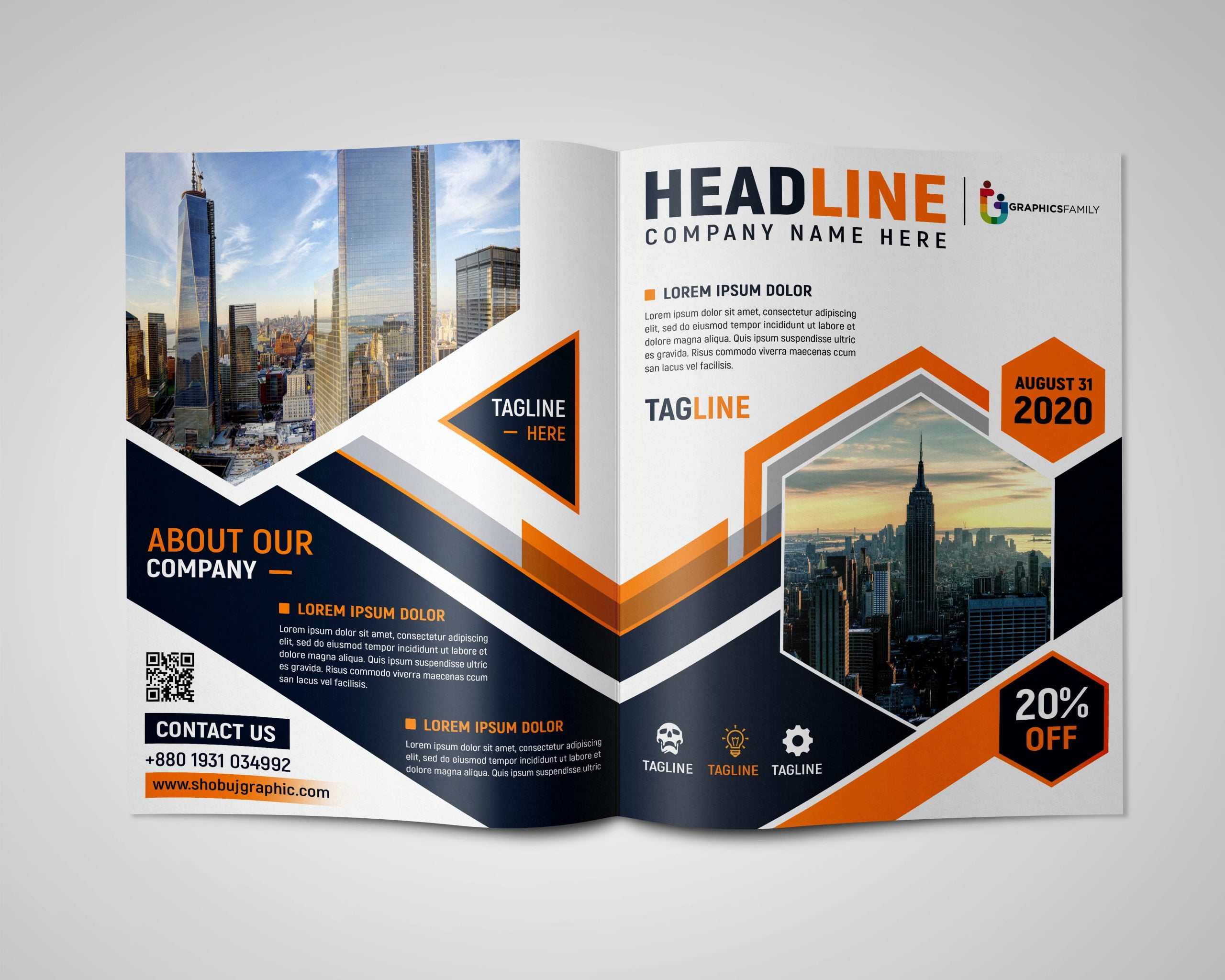
Credit: graphicsfamily.com
Key Design Elements
Key design elements make bi brochures effective and attractive. They help deliver the message clearly and catch the reader’s eye. Every part of the brochure should work together to create a strong impression.
Good design guides the reader smoothly through the content. It highlights important points without overwhelming the viewer. Careful choices in color, font, and layout shape the brochure’s success.
Headings And Subheadings
Clear headings help organize information. They break the content into easy sections. Readers find key points faster with bold, simple titles. Subheadings add details without cluttering the page.
Color Scheme
Colors set the mood and catch attention. Choose colors that match the brand and message. Use contrasting shades to highlight important parts. Keep the palette simple to avoid distraction.
Images And Graphics
Pictures show ideas quickly and clearly. Use high-quality images that relate to the content. Graphics like icons or charts explain facts simply. Balance images with text to keep focus.
Typography
Fonts affect readability and tone. Select clean, easy-to-read fonts for body text. Use bold or larger fonts for headings. Avoid too many font styles to keep the design neat.
Layout And White Space
A clear layout guides the reader’s eyes. Arrange elements in a logical order. White space prevents the design from feeling crowded. It gives the content room to breathe and stand out.
Color Schemes That Capture Attention
Color schemes play a big role in making bi brochures stand out. The right colors grab attention quickly. They create feelings and guide the reader’s eye. Choosing colors carefully helps make brochures more effective. Simple, clear color choices can make a big difference. Bright colors can excite, while soft tones can calm. The best color schemes fit the message and brand.
Bold and Bright ColorsBold colors like red, orange, and yellow catch the eye fast. These colors work well for important messages and calls to action. They create energy and excitement. Use bright colors for headlines or key points. Too many bright colors can overwhelm. Balance them with neutral tones for a clean look.
Calm and Cool TonesBlue, green, and purple create a calm, trustworthy feeling. These colors suit businesses that want to show professionalism. Cool tones help readers focus on the content. They work well for detailed information and charts. Pair cool colors with white space to keep the design fresh.
Neutral Palettes with a Pop of ColorNeutral colors like gray, beige, and white keep the design simple. Adding one bright color can highlight important sections. This method draws attention without overwhelming the reader. Neutral palettes create a clean, modern look. Use pops of color for buttons or key phrases.
Typography Tips For Readability
Typography plays a big role in making bi brochures easy to read. Good typography guides the reader’s eye through the content. It helps deliver the message clearly and quickly. Poor typography can confuse readers or make them lose interest.
Choosing the right fonts, sizes, and spacing improves readability. It also creates a professional look for your brochure. Follow simple rules to make your text clear and inviting. Here are key typography tips for bi brochures.
Use Clear And Simple Fonts
Select fonts that are easy to read. Sans-serif fonts like Arial or Helvetica work well. Avoid fancy or script fonts that blur letters. Simple fonts help readers scan text faster. Keep font styles consistent throughout the brochure.
Choose Appropriate Font Sizes
Use font sizes that fit your brochure’s layout. Body text should be at least 12 points. Headlines can be larger to stand out. Too small fonts strain the eyes. Very large fonts waste space and distract readers.
Maintain Proper Line Spacing
Line spacing, or leading, improves text flow. Set line spacing slightly larger than font size. This creates breathing room between lines. Crowded lines make reading difficult. Aim for 1.2 to 1.5 times the font size.
Limit The Number Of Fonts
Use two or three fonts maximum in your design. Too many fonts create a messy look. Pair fonts that complement each other. For example, a bold font for titles and a simple font for body text. Consistency builds a professional appearance.
Use Contrast For Better Visibility
Make sure text color contrasts well with the background. Dark text on a light background is easiest to read. Avoid color combinations that strain the eyes. Contrast helps readers focus on the content quickly.
Incorporating Visuals Effectively
Visuals play a big role in making BI brochures clear and attractive. They help explain ideas fast and keep readers interested. Using images, charts, and icons smartly improves the message. Visuals break up text and make complex data easier to understand.
Choosing the right visuals and placing them well boosts the brochure’s impact. The goal is to guide readers through the information smoothly. Visuals should support the text, not distract from it.
Choosing Relevant Images
Select images that match your message. Avoid random pictures that confuse readers. Use photos or graphics that show data or concepts clearly. Relevant visuals make the brochure more trustworthy and professional.
Using Charts And Graphs
Charts and graphs explain numbers quickly. Pick simple designs that readers can understand fast. Use colors to highlight key points but keep it easy on the eyes. Good charts help readers see trends and comparisons instantly.
Balancing Text And Visuals
Keep a good mix of text and visuals. Too many pictures can overwhelm readers. Too much text makes the brochure dull. Space out visuals and text evenly for a clean look. Balance helps readers stay focused and absorb information better.
Maintaining Consistent Style
Use the same colors and fonts for all visuals. Consistency makes the brochure look neat and professional. Match visuals to your brand’s style. This creates a strong, unified message that readers remember.
Printing Techniques To Enhance Quality
Printing techniques play a big role in the look and feel of bi brochures. Good printing makes colors bright and text clear. It also helps the brochure last longer and feel better in the hand.
Choosing the right printing method can improve the quality a lot. It can make your brochure stand out from others. Different techniques work best for different paper types and designs.
Offset Printing For Sharp Details
Offset printing is popular for high-quality brochures. It uses plates to transfer ink onto paper. This method creates sharp images and crisp text. It suits large print runs because it is cost-effective.
The colors stay consistent and vibrant. It works well for brochures with many photos or fine lines. Offset printing gives a smooth finish that feels professional.
Digital Printing For Quick Turnaround
Digital printing works well for small batches of brochures. It does not need printing plates. This saves time and lowers setup costs. You can print full color images easily with digital methods.
The quality is good, though not as sharp as offset. Digital printing allows easy customization of each brochure copy. It suits businesses needing fast, flexible printing solutions.
Spot Uv Coating For Gloss And Texture
Spot UV coating adds shine to specific areas of the brochure. It highlights logos, images, or text with a glossy finish. This makes parts of the brochure catch the light and attention.
The coating also adds a slight texture, giving a tactile feel. Spot UV helps important details stand out. It works best on thick paper or cardstock.
Embossing For A Raised Effect
Embossing creates raised patterns or text on the brochure’s surface. It adds a 3D effect that readers can feel. This technique gives a unique and elegant look.
Embossing works well with logos or headlines. It pairs nicely with foil stamping for luxury brochures. This method adds sophistication and a premium touch.
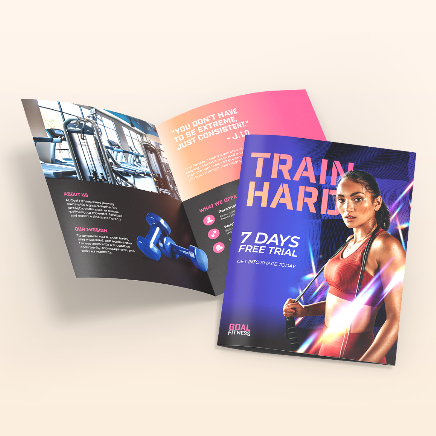
Examples Of Successful Bi Brochures
Successful bi brochures show how clear design and strong messages work well. They attract readers and explain products or services simply. These examples help understand what makes a brochure effective.
Good bi brochures use clean layouts and easy words. They focus on key benefits and include eye-catching images. This keeps the reader interested and informs quickly.
Simple Design And Clear Message
A successful bi brochure often uses simple design. White space helps separate text and images. The message is short and direct. This style makes reading easy and quick.
Strong Visuals And Colors
Bright colors and strong pictures grab attention fast. Photos show the product in use or happy customers. Visuals help explain ideas without many words.
Focus On Benefits, Not Features
Good brochures tell readers how the product helps them. They explain benefits clearly. This makes readers feel the product meets their needs.
Clear Call To Action
Successful bi brochures include a clear call to action. They tell readers what to do next. This could be calling a number or visiting a website. Clear steps guide readers easily.
Consistent Branding
Branded colors, logos, and fonts create trust. Consistency makes the brochure look professional. It helps readers remember the company better.
Credit: www.nextdayflyers.com
Frequently Asked Questions
What Are Bi Brochures Used For?
Bi brochures are used to share information about products or services. They help businesses explain key details quickly. These brochures are easy to carry and distribute.
How Do Bi Brochures Improve Marketing?
Bi brochures highlight important features in a clear, simple way. They attract customers by using images and short text. This makes marketing messages easy to understand.
What Size Is A Typical Bi Brochure?
A typical bi brochure is usually 8. 5 x 11 inches. It folds once to create two panels on each side. This size fits well in hands and mailboxes.
What Content Should Be Included In Bi Brochures?
Include a catchy headline, product details, benefits, and contact info. Use bullet points for easy reading. Add images to make it visually appealing.
How To Design An Effective Bi Brochure?
Use simple fonts, clear headings, and balanced colors. Keep the layout clean with enough white space. Make sure the call-to-action stands out.
Can Bi Brochures Be Used Digitally?
Yes, bi brochures can be shared as PDFs or images online. They work well in emails or on websites. Digital use saves printing costs and reaches more people.
What Materials Are Best For Printing Bi Brochures?
Glossy or matte coated paper is ideal for bi brochures. It enhances colors and feels good to touch. Choose thicker paper for a professional look.
Conclusion
Bi brochures help share clear and useful information fast. They catch attention and explain your message well. Good design makes readers want to learn more. Use simple words and strong images to connect. A well-made brochure supports your goals and builds trust.
Choose the right style for your audience. Keep it neat and focused on key points. Bi brochures remain a smart tool for communication. They make ideas easy to see and understand. Try them to improve how you share your story.