
Have you ever noticed those colorful cards that pop up right at the top of search results or websites? Those are headercards, and they can change the way you see information online.
Thank you for reading this post, don't forget to subscribe!If you want to grab attention quickly and make your content stand out, understanding headercards is a game-changer. Keep reading to discover how headercards work and why they matter for your online presence. By the end, you’ll know exactly how to use them to your advantage.
Why Visual Headers Matter
Visual headers catch the eye quickly. They help visitors understand the page topic fast. A good header guides users to important content. It makes the website look clean and organized.
People scan pages instead of reading every word. Visual headers break the text into easy parts. This helps readers find what they want without effort. Clear headers also improve the overall user experience.
Grab Attention Immediately
Visual headers stand out on the page. Bold colors or images draw the eye right away. This keeps visitors from leaving too soon. A strong header invites users to explore more.
Improve Readability
Headers divide content into small sections. This makes reading easier and faster. Users can understand the message without confusion. Clear headers reduce frustration and increase interest.
Boost Seo Rankings
Search engines use headers to understand page structure. Proper headers help rank content better in search results. They highlight important keywords naturally. This brings more visitors to your site.
Create Brand Identity
Visual headers reflect your brand’s style and tone. Consistent design builds trust with visitors. They remember your site and come back later. Headers are a chance to show your unique look.
Credit: www.nextdayflyers.com
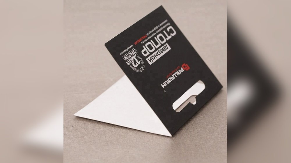
Choosing The Right Headercard Style
Choosing the right headercard style is important for product packaging. It helps catch customer attention and shows product details clearly. The right style fits the product size and brand personality. It also makes the product easy to display and carry.
Different headercard styles serve different purposes. Some are simple and cost-effective. Others offer extra space for branding or product information. Understanding these styles helps pick one that suits your needs best.
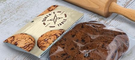
Simple Fold-over Headercards
Simple fold-over headercards wrap over the product top. They are easy to make and use less material. This style suits small, light products. It provides enough space for basic branding and price tags.
Die-cut Headercards
Die-cut headercards have custom shapes and cutouts. They create a unique look that stands out on shelves. This style adds extra appeal to the product. It also helps display product parts clearly.
Double-layer Headercards
Double-layer headercards have two layers of material. This style offers more space for graphics and information. It adds strength and durability to the packaging. Best for heavier products that need extra support.
Perforated Headercards
Perforated headercards have small cuts for easy tearing. They allow customers to open packaging without tools. This style enhances customer experience and product access. Useful for products needing quick and simple opening.
Custom Printed Headercards
Custom printed headercards use detailed designs and brand colors. This style creates a strong brand identity. It helps products stand out in competitive markets. Printing quality affects the overall look and feel.
Design Tips For Stunning Headers
Headers are the first thing visitors see on a website. A stunning header grabs attention and sets the tone. Good design helps users understand your message quickly. Clear and simple headers make a strong impression. Use design tips to create headers that stand out and look great.
Use Clear And Readable Fonts
Choose fonts that are easy to read on all devices. Avoid fancy or complex fonts. Use a font size that is large enough to see easily. Keep font colors contrasting with the background. This helps visitors read your header without strain.
Keep The Layout Simple
Too many elements can confuse visitors. Use space wisely to avoid clutter. Align text and images neatly. A clean layout helps focus on the main message. Simplicity improves user experience and keeps visitors engaged.
Choose Colors Wisely
Colors affect mood and readability. Pick colors that match your brand. Use a limited color palette for harmony. Ensure the text color stands out from the background. Good color choices make headers more attractive and clear.
Add A Strong Call-to-action
A clear call-to-action guides visitors on what to do next. Use simple words like “Learn More” or “Get Started.” Place the call-to-action button where it is easy to find. This helps increase clicks and user interaction.
Use High-quality Images
Images can make headers more appealing and relevant. Choose sharp, clear images that relate to your content. Avoid low-quality or pixelated pictures. Proper images support your message and draw attention.

Credit: www.48hourprint.com
Integrating Headercards With Content
Integrating headercards with content helps create clear and organized pages. Headercards act as visual markers that guide readers through different sections. They make content easier to scan and understand.
Using headercards properly improves user experience and keeps visitors engaged. They separate topics and highlight key ideas in a clean way. This structure makes reading smooth and less tiring.
What Are Headercards?
Headercards are small blocks that show a title or icon above content. They stand out from normal text. This difference helps readers find important parts quickly. Headercards often include colors or borders for better visibility.
Placing Headercards In Content
Place headercards before each new section or topic. This placement signals a change in subject. Keep the headercard close to the related text. Avoid placing too many headercards on one page to reduce clutter.
Design Tips For Headercards
Choose simple fonts and clear colors for headercards. Use consistent size and style throughout the page. Make sure headercards contrast well with the background. This contrast helps readers notice them fast.
Benefits Of Using Headercards
Headercards improve page navigation and content flow. They help readers find information without effort. This ease increases the chance visitors stay longer on the site. Well-placed headercards also support better SEO by structuring content logically.
Tools For Creating Headercards
Creating headercards can enhance your website’s appearance and user experience. Various tools make this process simple and efficient. These tools offer templates, customization options, and user-friendly interfaces.
Choosing the right tool helps you design headercards that fit your brand and style. Many tools do not require advanced skills. Beginners and professionals can use them with ease.
Adobe Photoshop
Adobe Photoshop is a popular tool for creating headercards. It offers powerful editing features and full control over design elements. You can create custom shapes, add text, and adjust colors. Photoshop works well for detailed and unique headercards.
Canva
Canva is an easy-to-use online tool. It provides many templates and design elements. Drag-and-drop features make design fast and simple. Canva is perfect for users who want quick results without complex steps.
Figma
Figma is a collaborative design tool used by teams. It allows real-time editing and sharing. Figma supports vector graphics and prototyping. It is ideal for creating interactive and modern headercards.
Snappa
Snappa offers ready-made templates for headercards. It has a simple interface for quick design. You can add images, text, and shapes easily. Snappa suits users needing fast and attractive headercards.
Crello
Crello is similar to Canva with many templates. It supports animation for dynamic headercards. Crello is user-friendly and offers many design tools. It helps create eye-catching headers quickly.
Credit: www.walmart.com
Measuring Engagement Impact
Measuring the impact of headercards on user engagement is vital. It helps to know if headercards attract attention and keep visitors interested. Tracking key metrics shows how well headercards perform. This insight guides improvements for better results.
Data collection tools capture user actions with headercards. These actions include clicks, views, and interactions. Analyzing this data reveals which headercards work best. It also shows what content users prefer.
Tracking Click-through Rates
Click-through rate (CTR) measures how often users click headercards. A high CTR means headercards catch user interest. Tracking CTR helps identify engaging designs and messages. Low CTR signals a need for change or testing.
Analyzing Time On Page
Time spent on a page shows user engagement depth. Headercards that encourage longer visits add value. Measuring this time helps understand content appeal. It also reveals if headercards guide users effectively.
Using Heatmaps
Heatmaps display where users click or focus on a page. They show if headercards attract eyes and clicks. Heatmaps help spot popular headercard placements. This data informs better layout decisions.
Monitoring Bounce Rates
Bounce rate shows how many users leave quickly after arrival. Headercards that lower bounce rates improve site retention. Tracking bounce rates helps measure headercard success. It also points out areas needing attention.
Common Mistakes To Avoid
Headercards are useful but easy to misuse. Avoiding common mistakes helps your cards stand out. Small errors can hurt user experience and lower engagement.
Focus on clear design and proper content. This guide points out frequent errors to skip.
Improper Text Size And Font
Text that is too small or fancy confuses readers. Use simple fonts and sizes that everyone can read.
Keep text clear and easy on the eyes. Avoid fonts that distract from the message.
Cluttered Layout
Too many elements make the card look messy. Give space around text and images.
Use clean layouts to guide the reader’s eye. Less clutter helps users focus on key points.
Poor Color Choices
Colors that clash or are hard to see reduce impact. Pick contrasting colors for text and background.
Test colors for readability on all devices. Avoid bright colors that strain the eyes.
Ignoring Mobile Users
Many view headercards on phones. Designs that don’t adjust can break or look bad.
Make sure cards resize and remain clear on small screens. Mobile-friendly design is a must.
Missing Clear Call To Action
Without a clear action, users get confused. Tell users what to do next.
Buttons or links should stand out and be easy to click. Clear calls boost interaction.
Frequently Asked Questions
What Are Headercards In Web Design?
Headercards are visual elements placed at the top of a webpage. They help highlight important content or links quickly. They improve user navigation and page appearance.
How Do Headercards Improve Website Navigation?
Headercards show key information or links clearly at the top. This helps visitors find what they need faster. It reduces confusion and improves user experience.
Can Headercards Increase User Engagement?
Yes, Headercards grab attention with clear visuals and messages. They encourage users to click or explore more content. This can lead to longer visits and more interactions.
What Content Works Best In Headercards?
Short, clear text with a strong message works best. Use simple images or icons to support the message. Avoid clutter to keep it easy to read and understand.
Are Headercards Mobile-friendly?
Properly designed Headercards adjust to different screen sizes. They keep important info visible on phones and tablets. Responsive design is key for mobile-friendly Headercards.
How Do Headercards Affect Website Seo?
Headercards can improve SEO by highlighting key keywords and links. They help search engines understand page focus better. Good design also lowers bounce rates, boosting SEO.
What Tools Help Create Headercards Easily?
Many website builders include Headercard templates for easy use. Graphic tools like Canva or Figma help design custom Headercards. Choose tools that fit your skills and needs.
Conclusion
Headercards offer a clear and simple way to organize information. They help users find what they need quickly. Using headercards improves website design and user experience. Easy navigation keeps visitors on your site longer. Small changes like these make a big difference.
Try adding headercards to your next project. See how they help your content stand out. Simple tools often bring the best results.