Your business card is more than just a piece of paper—it’s your first impression. When you hand someone a card that looks sharp and feels sturdy, it says a lot about your professionalism and attention to detail.
Thank you for reading this post, don't forget to subscribe!But how do you make sure your business cards stand out with high quality every time? If you want your card to leave a lasting impact, keep reading. This guide will walk you through simple, effective steps to print business cards that truly represent your brand and grab attention.
Ready to make your business card unforgettable? Let’s dive in.
Choosing The Right Paper
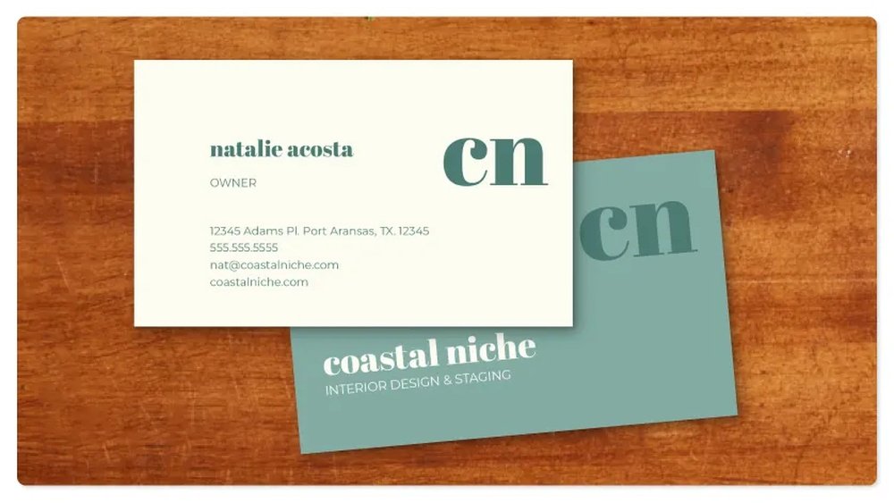
Choosing the right paper is key to printing high quality business cards. Paper affects the feel, look, and durability of the card. It helps your card stand out and leaves a strong impression on clients. Select paper that matches your brand style and the message you want to send.
Paper Types For Business Cards
Many paper types exist for business cards. Common choices include matte, glossy, and uncoated. Matte paper offers a smooth, non-shiny surface. It feels soft and looks elegant. Glossy paper shines and shows colors vividly. It works well for bright designs. Uncoated paper has no shine and feels rough. It gives a natural, classic look. Each type suits different styles and purposes.
Weight And Thickness Considerations
Paper weight impacts card quality. It is measured in grams per square meter (gsm). Higher weight means thicker and stronger paper. Standard business cards use 300-350 gsm paper. Thicker cards feel more solid and last longer. Thin cards may feel cheap or bend easily. Choose a weight that fits your budget and style. Thickness also affects how the card handles and stores.
Finish Options
Finishes change the look and protection of cards. Common finishes include matte, gloss, and satin. Matte finish reduces glare and looks smooth. Gloss finish adds shine and highlights colors. Satin finish blends softness and shine. Special finishes like spot UV or foil add texture and shine. Finishes protect the card from dirt and damage. Pick a finish that matches your design and usage.
:max_bytes(150000):strip_icc()/GettyImages-185290004-5ad89fc4eb97de003770381a.jpg)
Credit: www.thebalancemoney.com
Designing For Clarity
Designing for clarity is key to making business cards easy to read. A clear design helps your information stand out. It makes a good impression and improves communication. Simple choices in layout, fonts, and colors boost clarity. This section breaks down these elements for better card design.
Optimal Dimensions And Layout
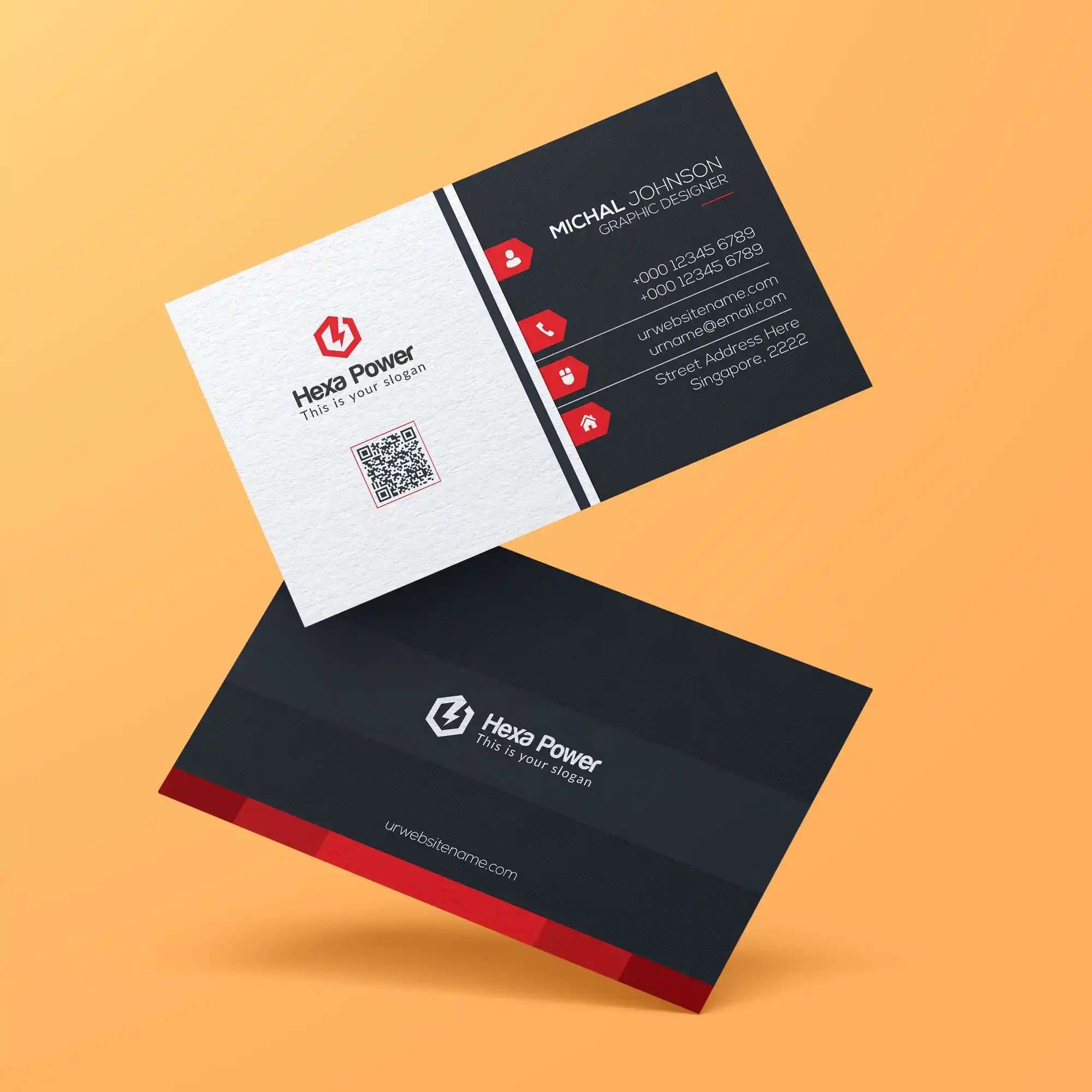
Choose standard business card size, usually 3.5 by 2 inches. This fits most wallets and cardholders. Keep margins around the edges to avoid cutting off text. Use a clean layout with enough space between elements. Avoid clutter by limiting text and images. Align text neatly to guide the eye smoothly.
Font Selection And Size
Select clear, easy-to-read fonts like Arial or Helvetica. Avoid fancy or script fonts that are hard to read. Use font sizes between 8 and 12 points for body text. Your name and title can be slightly larger. Bold important details, but do not overuse bold styles. Consistent font style keeps the design uniform.
Color Schemes And Contrast
Choose colors that contrast well between background and text. Dark text on a light background works best. Avoid using too many colors that distract the reader. Stick to two or three colors for a clean look. Test your colors by printing a sample card. Ensure the text stands out clearly on the card.
Using High-resolution Images
Using high-resolution images is key to printing sharp and clear business cards. Low-quality images look blurry and unprofessional. High-resolution images keep details crisp and colors vibrant. This makes your business card stand out and appear more trustworthy.
Image Quality Requirements
For business cards, images should be at least 300 dpi (dots per inch). This resolution ensures the image prints clearly without blurring. The image size must match the card dimensions or be larger. Avoid stretching small images to fit. A larger, high-res image keeps edges smooth and text readable.
File Formats To Use
Save images in formats that keep quality intact. Preferred formats are PNG, TIFF, and high-quality JPEG. PNG files keep colors sharp and support transparency. TIFF files work well for print with no loss in quality. Avoid using low-res JPEGs or GIFs. They compress data and reduce image clarity.
Avoiding Pixelation
Pixelation happens when an image is too small for the print size. It shows as blocky, rough edges. To avoid this, use images with enough pixels. Check image size in pixels before printing. Do not enlarge images beyond their original size. Instead, choose images created for print use. This keeps your business card looking professional and clear.
Choosing The Right Printing Method
Choosing the right printing method is key to high quality business cards. The print style affects color, texture, and cost. Knowing the options helps you pick the best fit for your needs. Each method has unique strengths and limits. Understanding these can save time and money.
Digital Printing Pros And Cons
Digital printing is fast and affordable for small runs. It uses laser or inkjet printers. You get bright colors and sharp images. Changes to the design are easy and cheap. Great for quick prints or many different cards.
Drawbacks include less color accuracy than other methods. The texture is usually flat. Not the best for very thick paper or special finishes. Best for simple, vibrant designs.
Offset Printing Benefits
Offset printing offers high quality and smooth colors. It uses plates to transfer ink to paper. Ideal for large orders with consistent results. Colors look rich and details are sharp. Works well with thick paper and special inks.
It takes more time and costs more upfront. Best for professional, polished business cards. Great if you want a premium feel.
Specialty Printing Techniques
Specialty techniques add unique touches to cards. Examples include foil stamping, embossing, and spot UV coating. These create texture and shine that stand out. Perfect for making a strong impression.
They cost more and require special equipment. Usually combined with offset printing. Use them to highlight logos or important text. Adds luxury and tactile interest.
Setting Up Files For Print
Setting up your files correctly is key to printing sharp, professional business cards. Preparing files for print ensures your design looks exactly as you want. It helps avoid mistakes like cut-off text or dull colors. Understanding the basics of file setup is the first step to high-quality prints.
Bleed And Margin Settings
Bleed is extra space around your design. Printers use bleed to cut cards cleanly without white edges. Add at least 3mm of bleed on all sides. Margin is the safe zone inside the card edges. Keep important text and logos inside the margin. Usually, a 5mm margin works well. This prevents anything from being cut off.
Color Profiles And Modes
Use the CMYK color mode for print files. CMYK matches printer inks better than RGB. RGB is for screens and may cause color shifts. Set your design software to CMYK before starting. Use the correct color profile recommended by your printer. This keeps colors accurate and vibrant on paper.
File Preparation Tips
Save your design as a high-resolution PDF or TIFF file. Set resolution to 300 DPI for crisp details. Flatten all layers to avoid missing elements. Embed all fonts or convert text to outlines. Check for spelling and alignment before saving. Avoid using low-quality images or graphics. Clear, sharp files print best and look professional.
Credit: hotcards.com
Selecting A Printing Service
Selecting the right printing service is key to getting high quality business cards. This choice affects how your cards look and feel. A good printer ensures sharp images, vibrant colors, and strong paper. It also helps your cards stand out.
Think about what matters most. Do you want fast delivery? Lower cost? Or a chance to see samples before buying? These points guide your decision.
Local Vs Online Printers
Local printers let you visit their shop and talk in person. You can check paper types and colors directly. This helps avoid surprises in the final product.
Online printers offer convenience. You upload your design and wait for delivery. They often have more design options and lower prices. But you cannot see the paper or print quality before ordering.
Choose based on your needs. Local printers suit those who want personal service. Online printers fit those who want ease and variety.
Evaluating Print Samples
Samples show real print quality. They reveal color accuracy, paper texture, and finish options. Ask the printer for samples before placing a large order.
Look closely at the text and images. Are the edges sharp? Are colors bright and consistent? Feel the paper thickness and smoothness. These details matter for a professional look.
Samples help avoid mistakes. They allow changes before printing hundreds of cards.
Cost And Turnaround Time
Prices vary between printers. Some charge more for premium paper or special finishes. Compare quotes from several printers.
Turnaround time is how fast you get the cards. Local printers may offer same-day pickup. Online printers usually take a few days to deliver.
Balance cost and speed. Cheaper options may take longer. Faster service often costs more. Choose what fits your budget and schedule.
Post-printing Finishes
Post-printing finishes improve the look and feel of business cards. They protect the card and make it last longer. Finishes also help the card stand out and look more professional. Choosing the right finish affects how people see your brand. Below are popular post-printing finishes for high-quality business cards.
Lamination Types
Lamination adds a thin plastic layer on the card’s surface. It protects against dirt, water, and wear. Glossy lamination makes colors bright and shiny. Matte lamination gives a smooth, non-shiny finish. Soft-touch lamination feels velvety and elegant. Each type changes the card’s texture and look.
Embossing And Foil Stamping
Embossing raises parts of the card’s design. It creates a 3D effect you can feel. Foil stamping adds shiny metallic colors like gold or silver. Both finishes add luxury and catch attention. Use them for logos, names, or special details. They make cards look unique and classy.
Cutting And Edging Options
Cutting shapes the card’s size and edges. Standard cards have straight edges. Rounded corners make cards safer and stylish. Die-cut cards come in custom shapes like circles or squares. Edging adds color to the card’s sides. It creates a subtle but striking detail. These options make your card memorable and different.
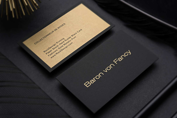
Credit: www.rockdesign.com
Frequently Asked Questions
What Paper Type Is Best For High Quality Business Cards?
Thick cardstock with a matte or glossy finish ensures durability and sharp colors. Choose at least 300gsm for a professional look.
How Does Resolution Affect Business Card Printing Quality?
Higher resolution (300 dpi or more) produces sharper images and text. Low resolution leads to blurry and pixelated prints.
Should I Use Cmyk Or Rgb Color Mode For Printing?
Use CMYK color mode for printing as it matches printer inks. RGB is for digital screens and may distort colors.
What Are The Key Design Tips For Sharp Business Cards?
Keep text readable, use vector graphics, and avoid clutter. Use contrasting colors and leave margins for clean edges.
Conclusion
Printing high quality business cards takes careful choices. Pick good paper and clear images. Use simple fonts that are easy to read. Check colors to make your card stand out. Always print a test copy first. Small details make a big difference.
Your business card shows who you are. Make it look sharp and professional. Follow these tips to create cards that impress. Keep your design clean and neat. A well-made card helps you connect and grow.