Table of Contents
As a content creator, I’ve seen firsthand how powerful high-quality printed materials can be. Whether it’s a stunning brochure, a crisp business card, or an eye-catching poster, the impact of professional printing is undeniable. Poor print quality can undermine your brand and message, leaving a less-than-stellar impression. Conversely, a polished, professionally printed piece elevates your brand, conveying professionalism and attention to detail. In a world increasingly dominated by digital communication, tangible, high-quality printed materials stand out, making a lasting impression. This isn’t just about aesthetics; studies show that printed materials can have a stronger emotional impact and better recall than digital counterparts. So, let’s dive into the 15 expert printing tips that will ensure your printed projects are nothing short of flawless.
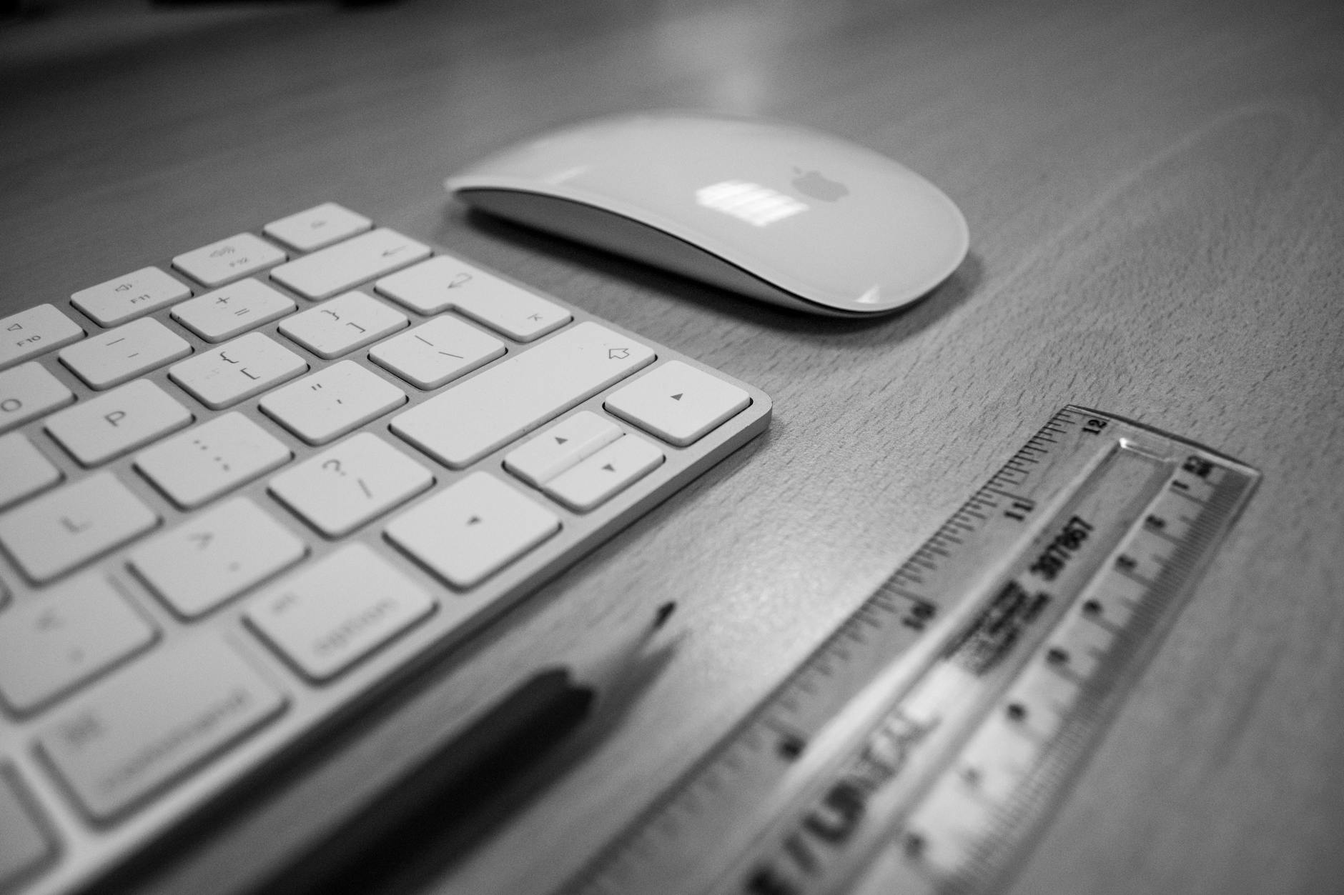
Essential Tools and Software for Print Design

Choosing the right tools is the first step towards achieving print perfection. Industry-standard software like Adobe InDesign, Illustrator, and Photoshop provide comprehensive control over layout, typography, and image manipulation. These tools aren’t just for seasoned professionals; they offer powerful features for beginners as well.
-
Beginner-Friendly: For those just starting out, consider Affinity Publisher, a more affordable alternative to InDesign, or even Canva for simpler design needs. Microsoft Publisher and Scribus are also viable options for creating basic layouts.
-
Intermediate to Advanced: As your skills progress, exploring Adobe Creative Suite or CorelDRAW will unlock a world of advanced features for creating sophisticated designs. QuarkXPress remains a robust choice for complex publishing projects.
Remember, the best software for you depends on your budget, skill level, and the complexity of your projects. Experiment and find the tools that best fit your workflow.
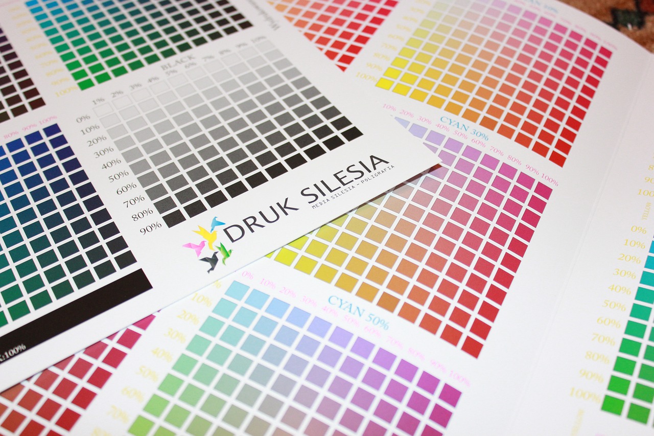
Mastering CMYK Color Space

One of the most critical aspects of print design is understanding color. Unlike digital screens that use RGB (Red, Green, Blue), printers use CMYK (Cyan, Magenta, Yellow, Black). Designing in RGB and then converting to CMYK can lead to unexpected color shifts and disappointing results.
-
Start with CMYK: Always begin your design process in CMYK color space to ensure accurate color representation from the outset.
-
Use Color Profiles: CMYK profiles help standardize color across different devices and printers. Consult with your print shop to determine the best profile for your project. Common profiles include GRACoL2013_CRPC6.icc and Fogra39L.icc.
-
Test Prints: For color-critical projects, invest in a hard copy proof to verify colors before committing to a large print run. This will save you time and money in the long run.

## Designing with the End Product in Mind
Before you even open your design software, visualize the final product. Are you designing a brochure, a poster, a business card? Each medium demands a different approach.
-
Brochures: Consider the folds and how the information will flow across the panels. Plan for clear calls to action and ample white space.
-
Posters: Focus on visual impact and readability from a distance. Use bold typography and high-resolution images.
-
Business Cards: Prioritize concise information and a professional layout. Choose a card stock that reflects your brand identity.
By thinking about the final printed piece, you can tailor your design to its specific purpose and ensure maximum impact.

Learning from Existing Printed Works
Don’t reinvent the wheel! Analyze successful print designs to gain inspiration and learn from the best. Pay attention to layout, color schemes, typography, and the overall visual hierarchy.
-
Case Study 1: Apple’s product brochures are known for their minimalist design, high-quality photography, and clear messaging.
-
Case Study 2: Magazine layouts often employ dynamic grids and compelling typography to engage readers.
-
Case Study 3: Luxury brand packaging utilizes premium materials and intricate printing techniques to create a sense of exclusivity.
By dissecting successful examples, you can identify design principles and apply them to your own work.
Document Size and Spacing Guidelines
Precision is paramount in print design. Starting with the correct document size and bleed settings is crucial for avoiding costly errors.
-
Bleed: Extend your design elements beyond the trim lines by 0.125 inches (1/8 inch) to prevent white borders after trimming.
-
Margins: Set appropriate margins to ensure important content is not cut off. A safe margin of at least 0.25 inches is recommended.
-
Document Setup: In your design software, specify the final trim size and add the bleed area. Most design software provides templates for standard print sizes, such as business cards (2” x 3.5”), postcards (4” x 6”), and posters (11” x 17” or larger).
Accurate setup ensures your design prints as intended, avoiding frustrating surprises.

Consistency in Design Elements
Visual harmony is key to a professional-looking print piece. Maintain consistency in fonts, colors, and graphic styles throughout your design.
-
Font Families: Limit your font choices to two or three complementary fonts to create a cohesive look.
-
Color Palette: Develop a color palette and stick to it. This ensures a unified and visually appealing design.
-
Graphic Elements: Use consistent graphic styles, such as icons and illustrations, to reinforce your brand identity.
Consistency creates a sense of order and professionalism, enhancing the overall impact of your design.

Ensuring High-Quality Images
Blurry images are a print design disaster. Use high-resolution images (at least 300 dpi) to ensure sharp and clear prints.
-
Image Sourcing: Use stock photos from reputable sources or hire a professional photographer.
-
Image Resolution: Check the image resolution before using it in your design. Avoid scaling up low-resolution images, as this will result in pixelation.
-
Image Editing: Use image editing software to optimize images for print. Adjust brightness, contrast, and sharpness as needed.
High-quality images are essential for creating professional-looking print materials.
The Power of Proofing: When in Doubt, Print It Out
Digital previews can be deceiving. A physical proof is the most reliable way to catch errors and ensure your design looks exactly as intended.
-
Soft Proofing: Use your design software’s soft proofing feature to simulate the final print output on your screen.
-
Hard Proofing: Order a hard copy proof from your print shop. This allows you to evaluate the colors, paper stock, and overall quality of the print.
-
Review Checklist: Develop a checklist to guide your proofing process. Look for typos, image placement errors, color inconsistencies, and any other issues that may have been missed on screen.
Delivering the Right Files to Your Print Shop
Providing the correct file format and specifications is essential for a smooth printing process.
-
PDF/X-4: Save your design as a PDF/X-4 file. This format preserves fonts, images, and other design elements, ensuring consistent output across different printing systems.
-
Crop Marks and Bleed: Include crop marks and bleed in your PDF file. This guides the printer in trimming the final product accurately.
-
Embedded Fonts: Embed all fonts used in your design within the PDF file. This prevents font substitution issues during printing.
-
Packaged Files: Consider providing a packaged file that includes all linked images and fonts. This ensures the printer has everything they need to produce your design correctly.
Clear communication with your print shop and providing print-ready files will prevent delays and ensure your project runs smoothly.
Enhancing Comfort and Enjoyment in Print Design
Print design shouldn’t be a chore! Incorporate your personal style, experiment with new techniques, and find ways to enjoy the process.
-
Personal Touches: Don’t be afraid to inject your creativity into your designs.
-
Breaks and Inspiration: Take regular breaks to avoid burnout. Seek inspiration from other designers and creative fields.
-
Celebrate Small Victories: Acknowledge your progress and celebrate your successes along the way.
A positive attitude and a passion for your craft will shine through in your work.
Expert Printing Tips to Elevate Your Work
Once you’ve mastered the basics, explore advanced printing techniques to take your designs to the next level.
-
Embossing/Debossing: Add a tactile dimension to your prints with embossing or debossing.
-
Foil Stamping: Create a luxurious look with foil stamping.
-
Spot UV Coating: Highlight specific areas of your design with a glossy spot UV coating.
These specialized techniques can add a touch of elegance and sophistication to your printed materials.
Common Pitfalls and How to Avoid Them
Even experienced designers make mistakes. Here are some common pitfalls to watch out for:
-
Incorrect File Format: Always provide print-ready files in the correct format (PDF/X-4).
-
Low-Resolution Images: Ensure all images are high-resolution (at least 300 dpi).
-
Color Mismatches: Design in CMYK color space and use appropriate color profiles to avoid unexpected color shifts.
Creating a Checklist for Print Design Projects
A checklist can be a lifesaver, ensuring you don’t miss any crucial steps in the design-to-print process.
-
Project Brief: Define the project goals, target audience, and budget.
-
Design: Create the design in CMYK color mode, using high-resolution images.
-
Proofing: Review the design for errors and order a hard copy proof.
-
File Preparation: Save the design as a PDF/X-4 file with crop marks and bleed.
-
Printing: Send the print-ready files to your chosen print shop.
Conclusion
Mastering these 15 expert printing tips will empower you to create flawless printed materials that elevate your brand and make a lasting impression. Remember, print design is a journey of continuous learning and improvement. Experiment, explore new techniques, and don’t be afraid to push your creative boundaries. The world of print is full of possibilities, waiting to be discovered. Now go forth and create something beautiful!